Creating Interactive Figures with the New AAS Timeseries Tool
2019 September 23
Electronic publishing makes it possible to convey scientific content not just with static images but with interactive, exploratory visualizations. This is a big opportunity to improve the way we do science! So, the American Astronomical Society (AAS, publisher of the Astrophysical Journal, the Planetary Science Journal, and others) is working to make it as easy as possible to include “interactive figures” in your articles. This year AAS is launching new Jupyter-based tools to help you create interactive figures for two common data types: timeseries and sky images. With our recent announcement of the aas-timeseries package, I thought I’d write up the end-to-end workflow for making and submitting interactive figures with these new tools.
What Are We Doing Here?🔗
First, let’s step back a bit. What’s the big idea behind this project?
If you ask me, the big idea is communication: readers should be presented with a rich set of tools for exploring and understanding the data presented in research articles. Static plots and data tables are good, but electronic publishing makes it possible to do so much more! In one kind of ideal world, readers would be able to simply click on the data in an article and immediately start exploring them using their favorite analysis tools.
It sounds like it would be a lot of work for authors to wire up this kind of complex functionality. But what if we invert this vision — what if your favorite analysis tools could be embedded inside your publications? What if your tool could save not only data files, but itself, along with all of your data analysis setup — and someone else could trivially open it all up and start working in exactly the same analysis environment you used to do your research?
To achieve this vision would require some kind of universal platform for authoring and distributing custom, interactive, graphics-intensive software. Fortunately for astronomers, industry has poured billions of dollars into this very problem and come up with a pervasive, extraordinarily successful solution: the Web. If your data analysis tool is implemented in HTML and JavaScript, it is easy to embed elsewhere — and it’s only the proverbial Small Matter of Programming to be able to replicate its current internal state along with its main application code.
We run into a snag here since most scientific data analysis tools are not, in fact, implemented in HTML and JavaScript. But that’s changing, almost entirely thanks to the rise of the Jupyter ecosystem. While you might think of the “notebook” user interface paradigm as the big innovation in Jupyter, I would argue that more important is the fact that you interact with these notebooks through your web browser. Graphical “widgets” in Jupyter notebooks must be implemented in HTML, and this requirement is driving a development boom in Web-based scientific data analysis tools like vaex or vega.
Finally we get back to the AAS. Our new aas-timeseries package aims to embody this vision of an embeddable data analysis tool for the particular domain of timeseries data, chosen because it’s quite common in astronomy. It’s designed for the Jupyter environment for the reasons described above. We hope that you’ll find it to be a delightful data analysis tool — which just happens to provide you with a unique and powerful new way to help communicate your insights to the readers of your publications.
Without further ado, let’s work see how it all works in practice!
Step 0: Requirements🔗
The new tools are based on Python and Jupyter and we do assume here that you’re familiar with them.
If that’s the case, we’ve made it so that you don’t need to install any software, or have a data set on hand, to give the aas-timeseries tool a spin. Thanks to the magic of the cloud, we can create a Jupyter notebook that you can use to try out the first part of the workflow — just launch this link:
https://mybinder.org/v2/gh/aperiosoftware/aas-timeseries/master?urlpath=lab/tree/docs/getting_started.ipynb🔗
But for day-to-day usage, you’ll probably need to actually install the software. In particular, you need:
- Astropy version 3.2 or greater, with installation instructions here.
- The new aas-timeseries package, with installation instructions here.
You’ll also need a recent version of Jupyter installed, of course.
Step 1: Load Your Data Into a TimeSeries Object🔗
As we’ve tried to emphasize above, the new aas-timeseries package is all about interactive data analysis — its ability to generate interactive figures for AAS journals is just a piece of this larger purpose. So the first thing you need is data! The aas-timeseries tool uses the new astropy.timeseries module to store its underlying data. Here’s an example of how to create a timeseries data object using a downloadable sample dataset:
from astropy.utils.data import get_pkg_data_filename
from astropy.timeseries import TimeSeries

data_path = 'timeseries/kplr010666592-2009131110544_slc.fits'
filename = get_pkg_data_filename(data_path)
ts = TimeSeries.read(filename, format='kepler.fits')
The resulting object is essentially just a data table with a recognized time
column that helps with common timeseries analyses like phasing.
See the astropy.timeseries documentation for examples of other ways to get
common data formats into the TimeSeries data structure.
Step 2: Science!🔗
The next step is where you do the science. This walkthrough can’t help you with the most important parts of that effort, of course. But we can show you how to get started by displaying a single timeseries dataset:
from aas_timeseries import InteractiveTimeSeriesFigure

fig = InteractiveTimeSeriesFigure()
fig.add_markers(time_series=ts, column='sap_flux', label='SAP Flux')
fig.preview_interactive()
When run inside Jupyter, you’ll get the following interactive plot, which I’ve embedded in this post. Try zooming and panning, and check out the options in the hamburger menu in the top right!
As we all know, making that first plot is just the first step in a long journey. You’ll likely want to prepare much more elaborate visualizations as you progress — you should explore the aas-timeseries documentation to learn about the tool’s full capabilities.
Step 3: Replicate Your Data Analysis Setup🔗
You’ve gotten to know your data inside and out, and the sciencing is done. Now it’s time to prepare a publication! Because you’ve found our rhetoric so compelling, you’re eager to make use of aas-timeseries’ ability to embed your data analysis setup inside an interactive figure. Here’s where the magic happens — all you have to do is this:
fig.save_static('my_figure', format='pdf')
fig.export_interactive_bundle('my_figure.zip')
The first line creates the “static” version of your interactive figure — this is what will show up in the PDF version of your publication. The second line creates a Zip file that serializes your interactive data analysis environment.
(If you’re following along in one of the cloud-based notebooks, these files will appear in the left-hand pane of the JupyterLab interface after you run these commands, and you can click to download them to your local machine.)
Step 4: Include The Interactive Figure in Your Manuscript🔗
Since manuscripts are submitted as flat documents, they can only include the static version of your interactive figure. But you can now indicate the presence of interactivity in your submission. Assuming that you are using LaTeX, you should author your document using the new version 6.3 of AASTeX document class:
\documentclass{aastex63}Then, use the new interactive environment to mark your interactive figure in
the manuscript:
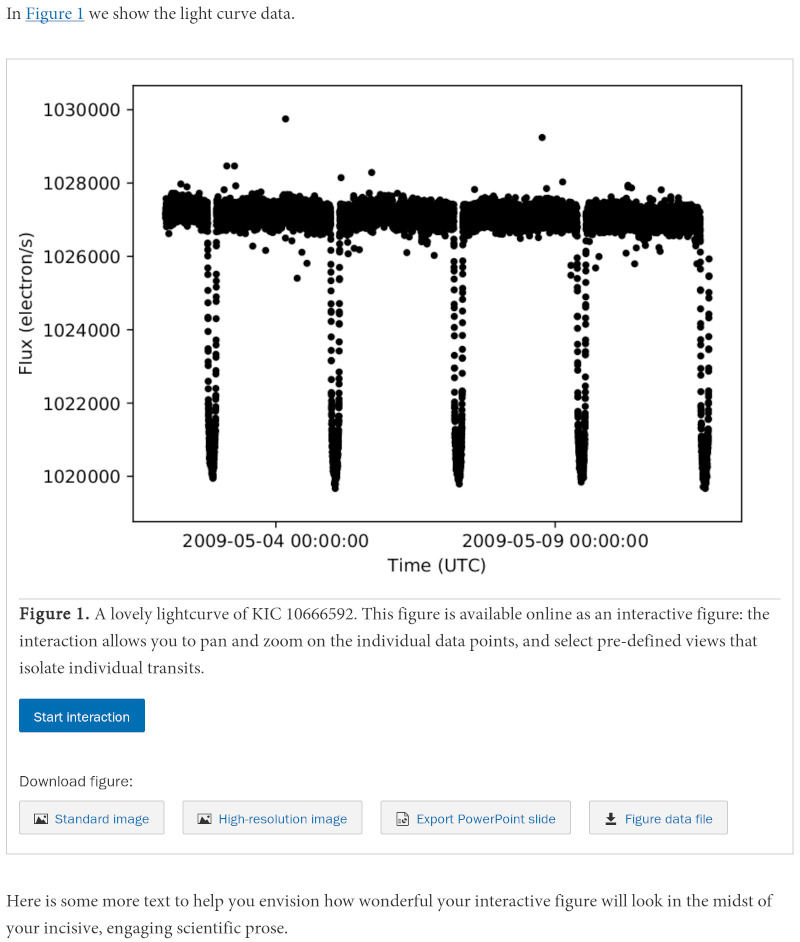
In \autoref{f.10666592} we show the light curve data.

\begin{figure}
  % Declare the interactive component:
  \begin{interactive}{timeseries}{my_figure.zip}
    % Show the static component:
    \includegraphics[width=\linewidth]{my_figure.pdf}
  \end{interactive}
  \caption{A lovely lightcurve of KIC~10666592. This figure is
    available online as an interactive figure: the interaction
    allows you to pan and zoom on the individual data points,
    and select pre-defined views that isolate individual transits.}
  \label{f.10666592}
\end{figure}
For accessibility reasons, it is important to describe the interactive component of the figure in the caption. Besides people with vision impairments, folks who are unable to experience the interactive component might include those with low-power machines or slow Internet connections, as well as readers of the PDF who are unable to obtain the online version of the article. The basic rule of thumb is that any relevant insights that can only be drawn from the interactive component of the figure should be described in the caption text.
Step 5: Submit and Celebrate!🔗
Once you’ve performed the above steps, “all” you have to do is submit your paper to an AAS journal and navigate the refereeing process! Here’s a mockup of what the final result might look like in the online version of your published article:
Readers will initially be presented with the static version of the figure (once again, this is for accessibility reasons) but when they click the “Start interaction” button they will get the same user interface that you used to analyze the data yourself.
Bonus Step: Post Your Data Elsewhere🔗
AAS interactive figures are simple HTML documents intended to be embedded as
iframes. So, you can include them (almost) anywhere that you can post HTML,
such as a personal website. Here’s a minimal sample HTML file, assuming that
you have unpacked your Zip bundle into a directory named my_figure:
<!DOCTYPE html>

<html lang="en">
  <head>
    <meta http-equiv="content-type" content="text/html; charset=UTF-8">
    <meta http-equiv="X-UA-Compatible" content="IE=edge,chrome=1">
    <style type="text/css">
      .intfig { width: 600px; height: 400px; }
    </style>
  </head>
  <body>
    <h1>Welcome to My Personal Webpage</h1>
    <p>Explore the data from my latest paper!</p>
    <iframe class="intfig" src="my_figure/index.html">
      <p>Unfortunately your browser doesn’t support iframes.</p>
    </iframe>
  </body>
</html>
Here, we have not been as serious about accessibility as the official AAS journals, and so haven’t implemented the click-through user interface used there.
Coming Soon🔗
Way up at the top I mentioned that AAS Publishing is also working on a similar infrastructure for sky images as well as timeseries data. This will be based on the AAS WorldWide Telescope project that I direct — more on that soon!
Finally, we should emphasize that all of these tools are open source, and intended to grow organically to meet the community’s needs. To contribute to the timeseries tool, check out the repository aperiosoftware/aas-timeseries on GitHub.